
MICKELSON TRAIL LOGO: RETAIL DESIGN
This project began as a labor of love. My family has been a trail supporter since the beginning, and my husband was the project manager for much of the development to convert the abandoned rail line into a premier recreational trail. That affection, my love of design, and the absence of any consistent commercial branding spurred the idea to create a logo for the Mickelson Trail, and a related logo for the organized Trail Treks each year.
|
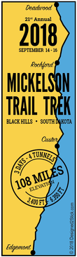
The 108-mile trail is a notably long rail trail that takes the walker or rider through some long, steep grades in areas that are otherwise inaccessible. It starts at an elevation of 3,453 feet at Edgemont and reaches its peak near the Dumont trailhead at 6,345, a gain of nearly 3,000 feet!
|
|
|
|

|
|
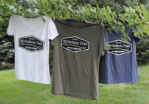
The logo is a pleasing elongated hexagon badge shape, and the text and background are in crisp black and white. It depicts the profile of the elevation of the trail in sharp detail, along with a notation of the elevations and the length of the main trail. The badge stands out as a durable sticker, sized to fit on a bike helmet, bicycle, water bottle, car, or just about anything else. It also is a stand out image for clothing, whether it's sweatshirts or t-shirts. All are available in the D2S Store on this website!
|
|
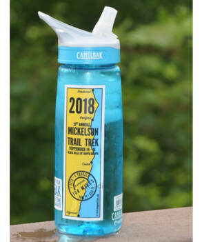
That same elevation profile was turned on its side to leverage the badge design into vertical Mickelson Trail Trek stickers for the annual trail ride (now held twice a year). The names of towns along the trail where riders stop each day were added for perspective, along with the round "stamp" boasting "3 Days," "4 Tunnels," "108 Miles," and the elevation. The year and date was added at the top so those participating in multiple years can collect the stickers as a way to show off their Black Hills accomplishments.
|